Data Analytics, Business Intelligence and Process Optimisation
I am an expert in Tableau, Power BI, Looker Studio, and their up/downstream data processing architectures. I understand their strengths and weaknesses as well as how to integrate various other tools into automated data processing (data warehouse/data mart architecture). While designing these solutions in line with existing and to-be business processes, I acknowledge that not all users should love to use tech, so it is also important to innovate business processes for streamlined outcomes.
BI Highlights at Work
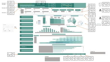
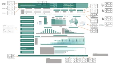
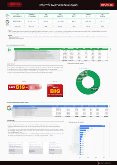
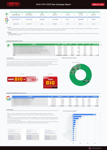
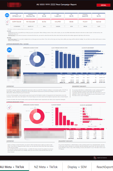
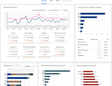
Power BI - Reusable Post-campaign-Report (PCR) Templates
I designed PCR templates specifically for a client team to reduce their daily reporting workload. The templates are the last step in a five-stage automated data mart architecture.
The pipeline involves Google Sheets, Excel, PowerQuery, Dataflow(PowerQuery online), Power BI Service, and Power BI templates.
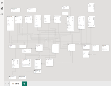
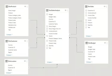
Power BI - Snowflake Data Modeling for Reporting
To facilitate the 10+ Power BI templates on different media data, I created a master snowflake model for data warehousing. The model is kept live and automatically refreshed on Power BI services, feeding real-time data connection to individual Power BI templates.
The model was tailored to user needs through constant consultation and communication.


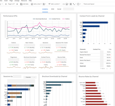
Google Looker Studio - Realtime reporting
Apart from Power BI, I also excel in Looker Studio within the Google Cloud ecology, particularly in digital marketing metrics and dimensions.
I also found Looker Studio as a terrific quick tool for testing and cross-checking. Clever data blending in Looker Studio offers some modelling capacity that is much faster than coding and Tableau setting up.
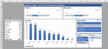
Excel Dashboard - SuperStore Sample
Let us not downplay Excel. PowerQuery, Power Pivot and MS Access are also powerful (and no extra cost) options for SMEs. Though using it will require quite some manoeuvres, like switching off autopilot for a manual flight.
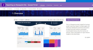

Sharepoint - Report Portals
I designed project-based Sharepoint portals as the output parts of a data pipeline. I found the tool especially helpful if your organization is already using MS 365 suite.


Tableau - Standardization for Project Management
Maintaining a unified look and design is especially challenging in Tableau because of its desktop publishing formatting style.
It is truly a design process and I kept communicating standardization in mind while endeavouring for better designs.
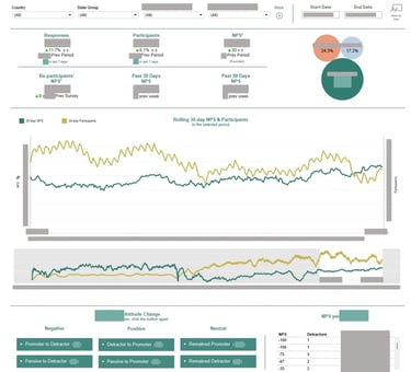
Tableau - Multi-layer Rolling NPS Calculation with a Timeline
This NPS dash is an example of how a simple calculation can become super complex, involving more than one layer of calculation over base NPS: customised period, comparison with the preceding period, demographic groups, etc.
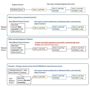
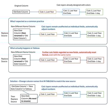
Tableau - An Example of Technical Problem-solving
I praise Tableau for its amazing flexibility. However, we have to acknowledge that it is designed very differently from MS and Google tools. This is an example of how a simple data source switch problem became a long headache until I came across a clue.

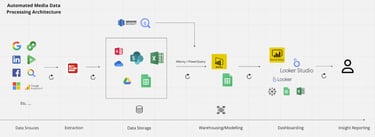
Power BI Service - A Media Data Processing Architecture
Without precedence in the organisation, I explored, researched, and designed this workflow (with every detail in connective steps, as well as data modelling in PowerQuery + Power BI service), which won me two Employee of the Month Awards. This is also why I believe there's always more than "I know SQL", understanding not only the business but also how the data should be handled and refreshed for consistency and accuracy.
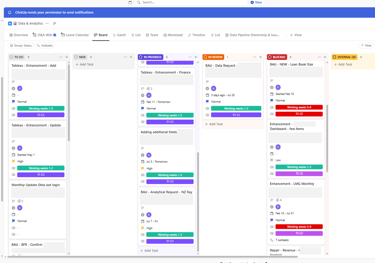
Project Management - Agile
I adopt advanced project management techniques and tools such as Kanban, Scrum, and other agile practices to manage complex, multi-phase tasks. Whether using ClickUp or Trello, I structure workflows to prioritize transparency, adaptability, and timely delivery.
Practices
Power BI - Star Schema Modelling for Marketing Insights
Constructing a star schema model in PowerBI I found automation is quite strong compared to SQL Server commands. The interactive viz shows gross margin and total revenue across product categories.
The analysis involved data modelling in PowerBI using Excel tables.
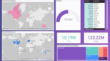
Power BI - Shipping Destinations
Using the Superstore data, this analysis presents the shipping destinations and their respective total value across the global markets. The visualization provides very strong clues in national sales data.
The analysis was completed using Excel and Power BI.
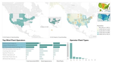
Tableau - U.S. Wind Power Operators - Investment Targets
I love to make the interactions interesting and intuitive. The dashboard shows competent wind power owners in the U.S. to be considered in a future investment portfolio. The map in the middle will automatically change and zoom in and out with the user selection of the companies. The interactive analysis mainly used Python and Tableau to generate insights.
Tableau - Customer Churn Analysis
In the GA capstone project, I focused on analysing a telecommunication company's customer churn in order to advise decision-making in future marketing plans.
The demographics analysis mainly involved using SQL, Python, the KNN model, and Tableau.

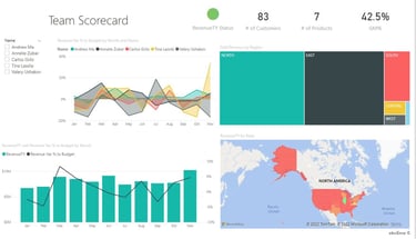
Power BI - Sales Agents Performance
The analysis used a popular sample data Superstore to visualize sales agents' performances in major global markets. The viz assists in performance evaluation.
The analysis was completed using Excel and Power BI.
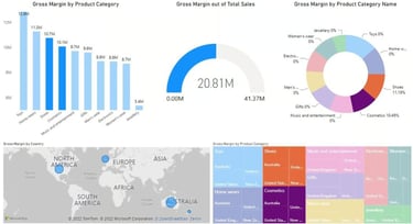
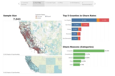
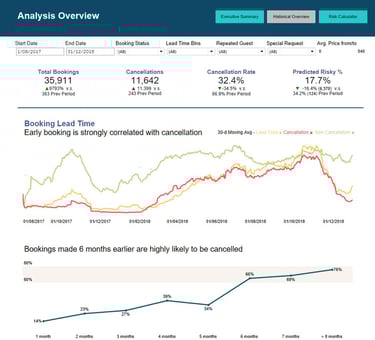
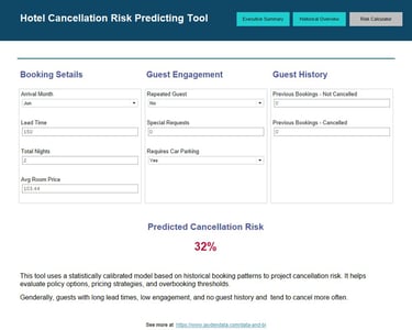
Tableau - Hotel Cancellation Predicting Tool
This dashboard visualises cancellation risk based on historical booking data, using a calibrated statistical model enhanced by logistic regression and machine learning (Random Forest).
It highlights key guest behaviours such as lead time, engagement, and booking history to guide proactive decision-making.


Whether you're reaching out for my analytics skills, got a project in mind, need tutoring for business/data analytics subjects, or want to ask about translation service, I'm all ears – use this form and I'll get back to you as soon as I can.