When analyzing KPI cards on a dashboard, it's common to encounter terms like year-on-year, month-to-month, week-to-week, period-to-period, previous month, one month ago, and previous period...a lot of mouthful word variations. Even as a seasoned language translator, I often find myself asking for clarification to understand exactly what these comparisons mean in the context of the dashboard.
To make these concepts clearer, I've created diagrams that illustrate some main scenarios I have encountered. These visuals aim to streamline our discussions and ensure everyone is on the same page when comparing data in BI tools.
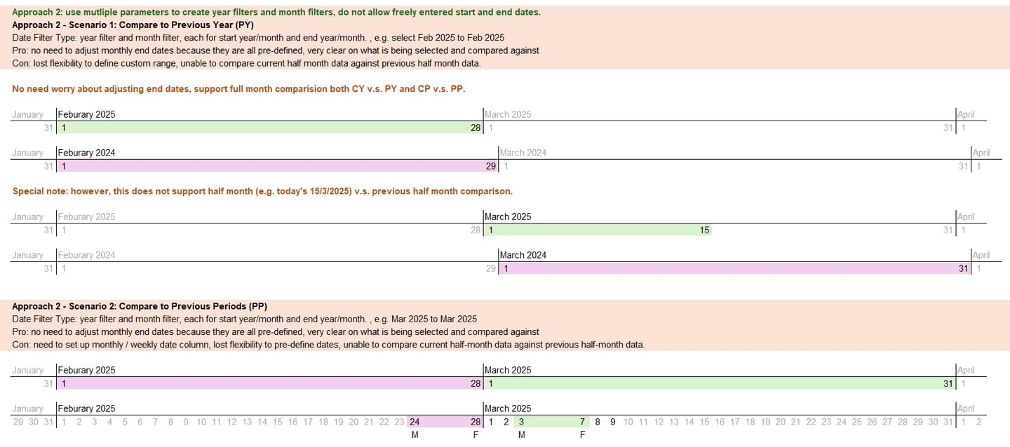
I've identified two main approaches for comparing date ranges in Tableau, each with its own strengths and weaknesses. The key difference lies in the date granularity we choose and the types of data filters we design for the dashboard.
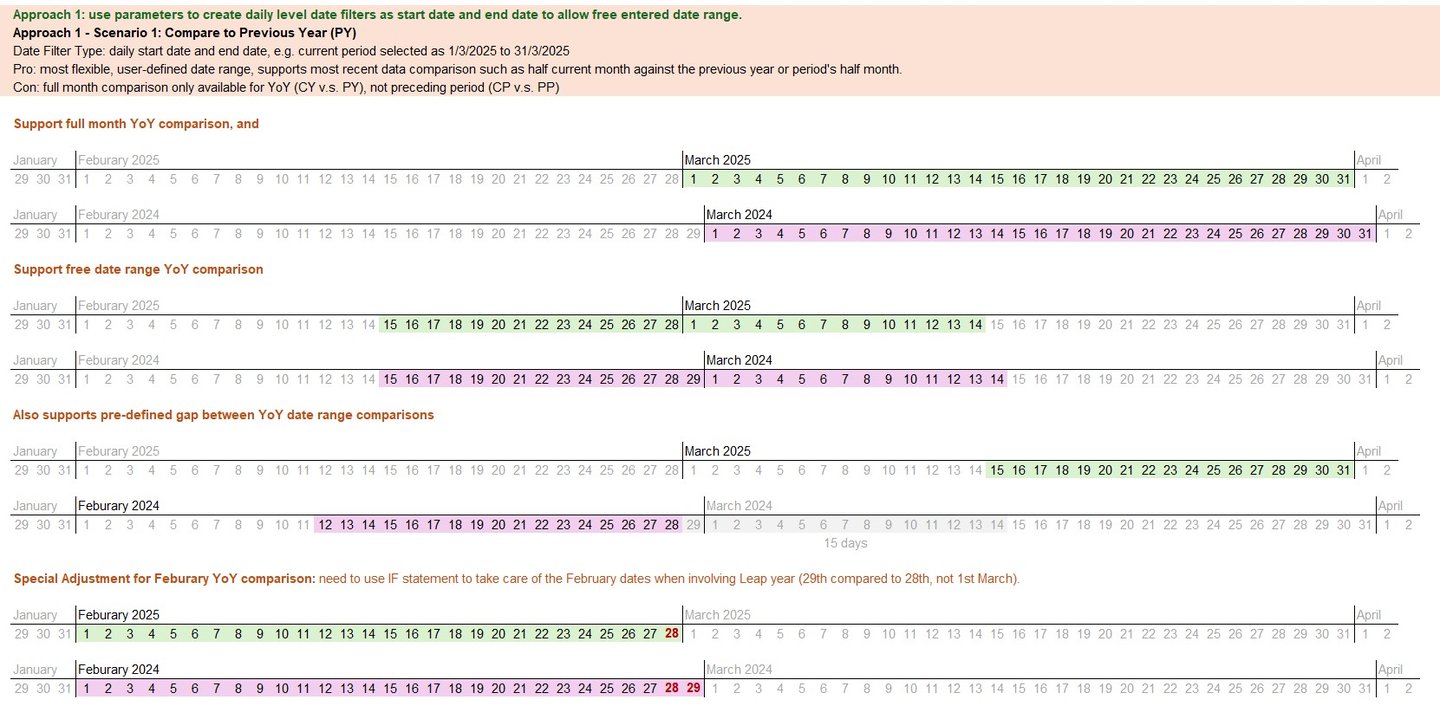
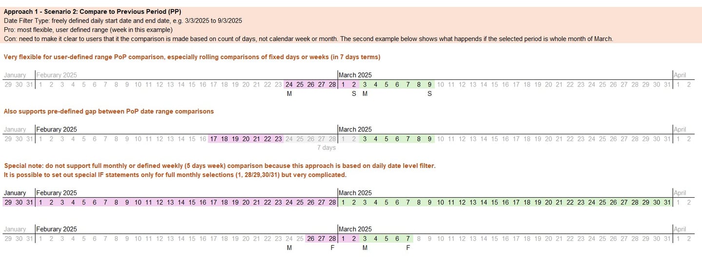
Approach 1 with daily date filters for high flexibility: this approach is my favourite due to its high flexibility and its ability to let users define their own date ranges. It's particularly suited for year-on-year (YoY) comparisons of the same period, such as all months except February in a leap year. This method empowers users to tailor the analysis to their specific needs while relieving some risks on the developer's shoulders.
Approach 2 with year and month filters to easily define dates: the second approach is less flexible but more straightforward. It uses monthly or weekly dates, making it easy to define start and end dates. This method is ideal for quick, consistent comparisons without the need for extensive customization. However, it will not be possible to easily compare the current half period against the previous half periods.
I hope these insights and diagrams will enhance clarity in our conversations, whether with a fellow data analyst, a colleague, or a stakeholder. Let's make our own data discussions more effective with visuals!
Whether you're reaching out for my analytics skills, got a project in mind, need tutoring for business/data analytics subjects, or want to ask about translation service, I'm all ears – use this form and I'll get back to you as soon as I can.