A Crossing between Visualization, Language and Media
This article explains and illustrates Kress and Leeuwen's (2021) social semiotic approach to explaining visuals. I found the framework is a very interesting cross-point between linguistics, media, and visual communication.
From tutoring a Media student, I have come across this exciting aspect of interpreting visuals: a so-called social semiotic approach. In essence, the related framework (genius in my view) proposed by Kress and Leeuwen (2021) seeks to view images as languages. As they put it in their book, the goal is to ‘break down the disciplinary boundaries between the study of language and the study of images’.
They tried successfully to connect interpreting visuals to the Sydney School of Functional Grammar, which I had learned back at UNSW when doing linguistic studies. Michael Halliday’s systemic functional linguistics (SFL) interprets language and communication in terms of functional components: Ideational, Interpersonal, and Textual Metafunctions (Halliday & Matthiessen, 2014).
This all sounds very theoretical and puzzling indeed. When Kress and Leeuwen (2021) put the framework into practice, I could see how interesting it becomes – to me it’s another perspective to look at everyday visuals such as a magazine cover page, or even a dashboard in data analytics. This approach may be familiar to Media students who already know social semiotics, but I believe it has great potential to make me think a bit differently as a data analyst.
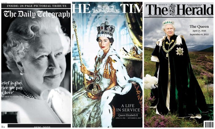
So, above are some cover images reporting Queen Elizabeth II’s death. Let's first take one of them as an example. To save us time, I will only interpret the Interpersonal (Interactive) and Textual (Composition) Metafunctions expressed in two of the pictures.
First, let’s take an image for analysis of the Interpersonal (Interactive) meanings being delivered. The interactive function means how the image creates a relation between the viewer and the viewed. Also, what attitude does the image imply.
According to Kress and Leeuwen (2021)’s framework, we can interpret this image from three angles: contact, social distance, and attitude. In terms of contact, the Queen appears at an earlier age and makes direct eye contact with the reader. This represents a Demand (in contrast to an Offer commonly seen in an ad). It is a demand for respect and establishing a close relationship as if she’s saying ‘Let’s become friends’.

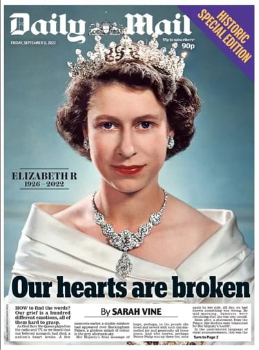
In terms of social distance, the photo is taken from a ‘close personal distance’, with which a reader may feel the Queen is within one arm’s reach. This implies an intimate relationship between the viewed (the Queen) and the reader. In addition, the image implies a very Subjective attitude with the Queen looking directly at the viewer in the Centre. This design demands Involvement, (rather the Detachment) from readers. The Queen’s face is noticeably placed at an eye-levelled position, this design implies Equality, rather than stronger or weaker Power between her and the viewer (yes, you).
Modality is a separate factor in interactive function. It means how realistic the image is felt by the reader. This can be expressed in the image’s colour qualities in saturation, differentiation, modulation and contextualization. For example, the Queen's image is shown in full saturation with great details including pieces of jewellery. This implies high validity to the reader as if ‘she’s alive and real’. This is the opposite in the image we are about to see next.
Without going deeper into the boring theories, let’s now shift to the analysis of a visual’s Textual Metafunctions. In Kress and Leeuwen (2021)’s framework, this compositional function can be analyzed from three angles: information value, framing and salience. Here I will only explain an example of the information value, which means how the placement of elements in the image will elicit different meanings. The placement here includes left/right, top/bottom and centre/margin.
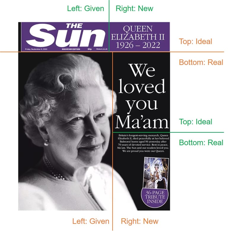

If only examine the left (given) / right (new) and top (ideal) / bottom (real) meanings elicited in the above image, we can see that there are two major pairs (in orange and green). First look at the orange pair: the news agency title line on the top implies ideology, while the imagery part below implies real news. When looking at the image, while the old Queen on the left is known by all of us, her passing away is a new message to everyone (words on the right).
The image also has a secondary level of textual structure represented by the green lines. In the title, while ‘The Sun’ indicates the agency’s name as an already given fact, the right side provides news on the Queen’s final legacy years. On the right side of the lower part, while 'we love' the Queen is written as an ideal statement, the passage in smaller words in the bottom part brings us to the real situation.
I will stop here to save you from reading this boring text, just to point out that the above is only a brief and superficial explanation of Kress and Leeuwen (2021)’s great framework to interpret visual communications from the perspective of a social semiotic approach. To avoid any copyright issues, the sources of this blog article are listed as references below with my full respect to the authors.
Disclaimer: This blog article is not written under any funding, nor is written for any financial gains. Please leave a message in the ‘Contact Me’ section if you want me to remove it for any reason.
References:
Halliday, M.A.K. and Matthiessen, C.K. (2014) Halliday's introduction to functional grammar. Milton Park, Abingdon, Oxon, UK: Routledge.
Kress, G.R. and Leeuwen, T.van (2021) Reading images: The grammar of visual design. London, UK: Routledge.
Picture Source: Shoaib, A. (2022) Here's how the UK and the world's top papers marked the Queen's death, Insider. Insider. Available at: https://www.insider.com/uk-world-newspapers-queen-elizabeth-death-2022-9#we-loved-you-maam-said-the-sun-britains-most-widely-read-tabloid-11.
